[See section on Images file
for information on editing the Main Controls screen PICTs themselves]
Note that the Main Controls screen PICTs do not need to be
the 640x386 size of the original Marathon Infinity ones - you
can make them larger (up to 640x480) or smaller as desired, though
do make sure that you don't have any buttons lying outside of
the area covered by the PICT (for obvious reasons:). You might,
for example, have a 640x480 screen that incorporates both buttons
and funky startup picture (rather than having a startup picture
and main controls on separate sequential screens). Screens smaller
than 640x480 will appear centered on screen surrounded by background
color.
The Main Controls screen can have its button layout widely
altered, including hiding any unused buttons altogether if you
wish (e.g. net play buttons in a solo-only conversion - just
set their coords to 0,0,0,0). Button layout is defined in the
'nrct' resource which can be edited using ResEdit. [Credit to
Mike Trinder for figuring this one out.] There is only one resource
(#128) with 18 entries in total. Rectangles 8 to 18 define the
Main Controls screen buttons (rectangles 1-7 define the HUD
layout). Each defines a rectangle with coordinates listed
in order of TOP, LEFT, BOTTOM, RIGHT:
nrct Resource Rectangle Definitions
Rectangle |
Top |
Left |
Bottom |
Right |
Button Name |
| 8 |
179 |
101 |
210 |
268 |
Begin New Game |
| 9 |
221 |
25 |
253 |
238 |
Continue Saved |
| 10 |
263 |
11 |
294 |
223 |
Gather Net |
| 11 |
301 |
38 |
333 |
236 |
Join Net |
| 12 |
304 |
421 |
331 |
563 |
Preferences |
| 13 |
386 |
231 |
413 |
406 |
Replay Last Film |
| 14 |
345 |
363 |
372 |
516 |
Save Film |
| 15 |
344 |
83 |
374 |
271 |
Replay Saved Film |
| 16 |
206 |
245 |
347 |
382 |
Credits |
| 17 |
264 |
522 |
291 |
588 |
Quit |
| 18 |
0 |
0 |
0 |
0 |
Unused |
|
(Editors note: With apologies to HAS and Mike Trinder, the
above makes me crazy trying to grok it. While it is true that
the data in the nrct resource is presented as shown above it
helps to get a handle on the areas plotted via XY coordinates.
I am too used to working with the XY coordinate system and for
those of you who have similar disgusting needs, below is the
same information in the XY coordinate system. - gls 09/26/2000)
nrct Resource XY Rectangle Coordinates
|
Rectangle |
Upper Left XY |
Lower Right XY |
Button Name |
| 8 |
(101 , 179) |
(268 , 210) |
Begin New
Game |
| 9 |
(25 , 221) |
(238 , 253) |
Continue Saved |
| 10 |
(11 , 263) |
(223 , 294) |
Gather net |
| 11 |
(38 , 301) |
(236 , 333) |
Join Net |
| 12 |
(421 , 304) |
(563 , 331) |
Preferences |
| 13 |
(231 , 386) |
(406 , 413) |
Replay Last Film |
| 14 |
(363 , 345) |
(516 , 372) |
Save Film |
| 15 |
(83 , 344) |
(271 , 374) |
Replay Saved Film |
| 16 |
(245 , 206) |
(382 , 347) |
Credits |
| 17 |
(522 , 264) |
(588 , 291) |
Quit |
| 18 |
( 0 , 0) |
(0 , 0) |
Unused |
|
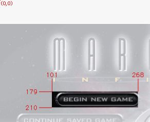
 The
image to the right shows how the 'Begin New Game' button (entry
#8) is defined. Note how the top and left values are inclusive,
but the bottom and right ones are exclusive (i.e. they aren't
part of the clickable area). All measurements are taken from
the top-left corner of the screen (640x480), not from the top-left
corner of the PICT. The
image to the right shows how the 'Begin New Game' button (entry
#8) is defined. Note how the top and left values are inclusive,
but the bottom and right ones are exclusive (i.e. they aren't
part of the clickable area). All measurements are taken from
the top-left corner of the screen (640x480), not from the top-left
corner of the PICT.
Although the clickable areas are always rectangular, you don't,
for example, need to make your 'button graphic' round (e.g. the
circular Marathon Infinity logo in Marathon Infinities Main Controls
screen). However, take care that you don't have any rectangles
overlapping otherwise this may result in unwanted behavior.
|
